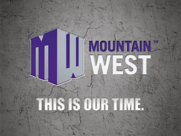
Earlier today, the Mountain West Conference released a new logo and theme. Unfortunately, the logo and theme are about as unimaginative as the Conference’s new tagline “This is our Time” and nickname “The Rock.” The release, which was supposed to mark a new era for a Conference that has only been around for 13-years, is somewhat of a disappointment.
The “This is or Time” tagline doesn’t really mean anything when the conference just lost BYU and Utah this year, and TCU in 2012. The Conference did attempt to make-up some ground by adding Boise State this season and Nevada, Fresno State, and Hawaii in 2012, but the Conference is still going to be viewed as middle-tier.
For the logo design, the Conference board of directors reached out to over 8,000 constituents to include coaches, athletes and fans, to get their take on the new MW boxy logo. The commissioner, Craig Thompson, stated: “The overwhelming majority of the people we spoke to said the Mountain West is bold, feisty and highly competitive, and we strongly believe these qualities are reflected in our new brand identity and our new logo.”
The question that remains: what were the other choices if this was deemed the best?


