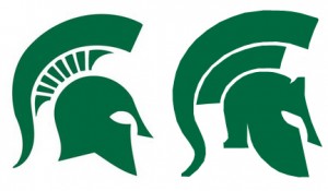
It appears Michigan State is getting a face lift. In December, the university applied for a patent (which is still pending) to secure the new look and the school plans to make an official announcement this April presumably before the spring game.
For you longtime fans, the logo still sticks to the traditional roots of Michigan State’s past designs. If you take a look at the two designs pictured above, you can see that the classic Spartan gladiator helmet looks a little more sleeker and accentuates its menacing presence.
At first glance, The Matador wasn’t too keen on the idea, but after a second look, the new design is not bad at all.
Check out what the fans are saying over at SpartanTailgate.com


