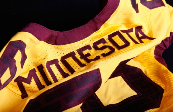
Head coach Jerry Kill made it very clear to Nike that the University of Minnesota wants a new look that captures the essence of the Gophers’ rich football tradition and history. After coming off a 3-9 season, it looks like Nike did exactly as asked–the Gophers unveiled their brand new Nike Pro-Combat look with a taste of old-school without the flair that other Nike school’s flash.
Players showed off the eight different combinations of gold, white and maroon jerseys with gold, white and maroon pants to match their new maroon matte finished helmets. The font feature was adopted from the Gophers’ 1940 team uniform, the year the team won its fourth National Championship. Other notable differences include in gold the word “Minnesota” where player names traditionally go. The numbers on the front use a brick inlay to pay homage to Memorial Stadium.
The uniforms were specifically designed and innovated to provide ultimate protection and maximum speed for each player. Every inch of the uniform was scrutinized to enhance protection to include the addition of carbon fiber plates to absorb impact in the “hit zone”.
The new look Gophers open the 2012 season on September 1 against UNLV at Sam Boyd Stadium. The uniforms may be drab and lack flair, but Kill expects to have a flashier season and improve from his diappointing two conference wins.


